-
Shop
- Advanced Technologies
- Arts, Crafts & Hobbies
- Bathroom
- Best Sellers
- Car Accessories
- Dating & Social Skills
- Digital Resources
- Beauty
- Electronics & Technology
- Emotional Intelligence
- Home Styling & Organization
- Mindfulness
- Nutrition & Healthy Eating
- Personal Style & Fashion
- Pet Lifestyle & Wellness
- Positive Thinking
- Productivity
- Self Confidence
- Sleep Improvement
- Stress Management & Relaxation
- TikTok Growth & Monetization Mastery
- Travel & Adventure
- Yoga & Mind-Body Practices
- Education & Learning
- Family & Parenting
- Fashion
- Alexander McQueen
- Bags
- Bags & Wallets
- Balenciaga
- Belts
- Blazers
- Bottega Veneta
- Brunello Cucinelli
- Burberry
- Chanel
- Chloé
- Dior
- Dolce & Gabbana
- Dresses
- Etro
- Fendi
- Gucci
- Hats & Hair Accessories
- Jacquemus
- Jewelry
- Jil Sander
- Jimmy Choo
- Kiton
- Luggage
- Miu Miu
- Off-White
- Outerwear
- Prada
- Rick Owens
- Saint Laurent
- Socks & Tights
- Sunglasses
- The Row
- Tom Ford
- Valentino
- Valentino Garavani
- Versace
- Vivienne Westwood
- Watches
- Fashion Accessories
- Furniture
- Gadgets
- Health & Beauty
- Health & Wellness
- Home & Garden
- Home Electronics
- Home Supplies
- Kids & Babies
- Kitchen
- Lighting
- Mindset
- Patio, Lawn & Garden
- Personal Growth
- Pet Care
- Pet Supplies
- Pets
- Shoes
- Sport & Outdoors
- Super Deals
- Travel
- Wealth
- Wealth Building
- Budgeting & Saving
- Cryptocurrency Investing
- Debt Management
- Entrepreneurship & Business Growth
- Family Finance & Budgeting
- Financial Independence
- Financial Mindset & Psychology
- Financial Planning
- Frugal Living & Expense Hacks
- Goal Setting
- High-Income Skills
- Investing Basics
- Leadership
- Motivation
- Networking & Mentorship
- Passive Income Strategies
- Real Estate Investing
- Side Hustles
- Stock Market Investing
- Winter Fashion
- YouTube Shorts Best-Sellers
Print Mixing Checklist: Easy, Balanced Outfit Pairings
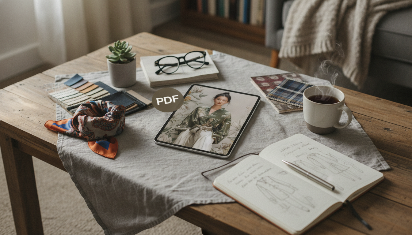
Mixing Prints Made Simple: A Checklist for Bold, Balanced Outfit Pairings
Print mixing can look effortless when a few clear rules guide the choices. The goal isn’t to wear “more pattern”—it’s to create a balanced outfit where each piece has a job: one leads, one supports, and something calm ties it all together. Use the checklist below to combine stripes, florals, plaids, polka dots, and animal prints without visual chaos, then lean on repeatable outfit formulas when you’re getting dressed fast. For more guidance, see Bold Ways to Mix Prints and Patterns in Your Outfits – AARP.
The 60-Second Print-Mixing Checklist
- Start with a hero print (the piece that leads), then add one supporting print and one solid.
- Keep at least one shared color across prints to create instant cohesion.
- Vary scale on purpose: one large motif + one small motif reads intentional.
- Anchor with a neutral (denim, black, white, tan, navy) to calm the look.
- Limit to 2 prints at first; add a 3rd only if the palette stays tight.
- Use one “quiet” print (thin stripes, micro dots, subtle checks) as the bridge.
- Finish with simple accessories when the outfit is busy; let prints do the talking.
Quick Pairing Cheatsheet (Pick a Row, Then Adjust Colors)
| Hero Print | Supporting Print | Best Shared Element | Easy Neutral Anchor |
|---|---|---|---|
| Floral | Thin stripe | One matching color (green, red, or blue) | Denim or white |
| Plaid | Polka dots | Same base color (navy/black) + small dots | Black trousers |
| Leopard/animal | Solid or micro check | Warm neutrals (tan/brown) or black | Cream knit |
| Bold stripe | Geometric | Same accent color (e.g., red) + different scale | Navy blazer |
| Abstract print | Tiny floral | Muted palette + one repeated hue | Beige skirt |
Choose a Color Strategy That Never Fails
Color is what makes mixed prints look “styled” instead of accidental. If you can get the palette right, the patterns almost take care of themselves. (If you’re curious about why certain shades feel energizing or calming, The Psychology of Color is a helpful starting point.) For further reading, see How To Mix Prints and Patterns in Your Outfits – Approximately Right.
- Two-color rule: choose prints that share two colors (one can be a neutral like cream, navy, or black).
- Monochrome mixing: combine different prints in the same color family (all-blue, all-black-and-white) for a polished, intentional look.
- Accent-led mixing: pull one bright accent from the hero print and repeat it in the supporting print or a single accessory.
- Turn prints into “color blocks”: if the blocks look compatible together, the outfit usually works even if the motifs differ.
Scale and Spacing: The Secret to Looking Intentional
When a mixed-print outfit feels “too much,” it’s often not the colors—it’s the scale and the density. Think of scale as volume and spacing as breathing room.
- Large + small is the easiest pairing: big floral with pinstripe; bold polka dots with micro-check.
- Avoid competing focal points: if both prints are large and high-contrast, one will usually overwhelm the other.
- Use spacing as balance: dense prints pair well with more open prints (less ink coverage).
- Add a solid “buffer” layer if both prints feel loud—try a cardigan, blazer, belt, or structured vest.
For inspiration on how pattern, texture, and motif have been used across eras (and why some combinations feel timeless), browsing the V&A Textiles & Fashion collection can spark fresh ideas without forcing you into trends.
Go-To Combinations That Work for Real Life
- Stripes + florals: a classic mix—keep the stripe narrow or keep the floral small if colors are bright.
- Plaid + animal print: surprisingly wearable when the palette is neutral and one print is smaller (micro leopard, subtle plaid).
- Polka dots + stripes: playful but tidy when one print is micro-sized and the colors repeat.
- Geometric + floral: modern contrast—choose a shared accent color and keep silhouettes simple.
- Denim as a “print neutral”: denim behaves like a calming texture that helps prints coexist.
Outfit Formulas (Swap Pieces Without Relearning the Rules)
Formulas make print mixing repeatable. Once you find one that feels like you, rotate colors, swap silhouettes, and keep the same logic.
- Work-to-weekend: printed blouse + printed skirt (different scale) + neutral shoes + minimal jewelry.
- Layered balance: printed dress + printed scarf (small print) + solid coat.
- Casual statement: printed top + printed sneaker/flat (tiny print) + solid bottoms.
- Print separation for beginners: top print + bottom print with a solid belt or jacket creating a visual break.
AI Styling Tips: Quick Prompts for Fresh Print-Mix Ideas
When you want new combinations without overthinking, structured requests help generate ideas that still feel wearable. Keep the request specific so the results stay cohesive.
Common Mistakes and Quick Fixes
Printable Checklist for Repeatable Results
Shop Checklists & Guides
- Mixing Prints Made Simple Checklist – Easy Fashion Guide for Bold Outfit Pairings, AI Styling Tips & Print Mixing Inspiration
- Checklist: Bright Mind Boost — Your Simple Daily Guide to Staying Positive | Digital Download for How to Keep Positive Thoughts
- How To Relax Your Body And Live With Less Stress
FAQ
How many prints can be worn at once without looking messy?
Start with two prints plus a solid. Add a third only when the palette is tight and at least one of the prints is subtle (like thin stripes, micro dots, or a small check).
What’s the easiest print to mix with everything?
Thin stripes, micro dots, and subtle checks act like “quiet prints,” so they pair easily with louder patterns. Just make sure at least one color repeats between the two pieces.
How can bold print mixing still look professional?
Keep the colors controlled (muted or monochrome), choose structured silhouettes, and include one neutral layer like a blazer or cardigan. Finish with minimal accessories so the outfit reads polished, not busy.
Recommended for you


Was this article helpful?
Yes
No








Leave a comment